ucs
Text Shadows
Follow this guide to learn how to add a text shadow to a website using the text-shadow CSS property!
Setup
Follow these steps to set up a new project for text shadows.
- Click here to go to the Starter project
- Open the index.html file for editing
- Add a
classattribute to the second<p>element that says “Style this paragraph…” - Set the
classto beupdate - Find the
<style></style>element - Create a new ruleset to style the paragraph by its class
- Use
.updateas the selector - After the selector, add curly brackets (
{and})
- Use
At this point, the added code should look something like this:
HTML
<p class="update">Style this paragraph...</p>
CSS
.update {

}
The project should be ready for styling.
Adding the Shadow
The cool thing about the text-shadow property is that there are a ton of different possibilities. You can control the color, location, and blur of the shadow!
Example
It looks something like this:
text-shadow: 1px 4px 8px blue;
Here is what each item does:
- h-shadow (
1pxin the example): position of the horizontal shadow - v-shadow (
4pxin the example): position of the vertical shadow - blur-radius (
8pxin the example): how much to blur the shadow - color (
bluein the example): the color the shadow should be
Adding the property example above to a piece of text would make it look like this:
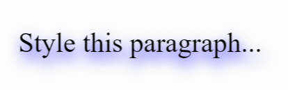
Updating the Project
Now, put some of that code in the Glitch project.
- Open the index.html file for editing, and find the
<style></style>element - In the
.updateruleset (between{and}), create a new property declaration withtext-shadow - Set the value for the
text-shadowproperty to be1px 4px 8px blue
Load up the page, and see the shadow appear! The code within the <style></style> element should look something like this:
.update {
  text-shadow: 1px 4px 8px blue;
}
Try playing around with the different values to see where it leads.
Click here for an interactive text-shadow generator tool! This site will allow you play around with the values, and will give you code to copy and paste at the end.